GuideOne changes logo after customer, employee feedback

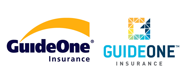
GuideOne Insurance’s logo since 1999, left, has been replaced with a G-and-1 combination as of today.
GuideOne Insurance has switched to a multicolored, stylized logo that combines a G and the numeral 1 as the company continues a transition to a modernized operation that goes past its church-insurance roots.
President and CEO Jessica Clark said the new logo marks the company’s transition to a more modern culture that is more transparent and appealing to younger workers.
The name GuideOne will remain. The company previously was Preferred Risk Mutual Insurance Co.
“We are going to change what our logo says about us based on where we are going and on feedback we’ve gotten from customers and our agents and our employees and the feeling we are trying to generate with our values,” Clark said.
The new logo replaces one that dated to 1999 and featured an arc over the name GuideOne. The change is part of a broader effort to modernize the company.
OBI Creative of Omaha created the new logo, which mixes greens, yellows, blues and other shades in geometric shapes that form the “G.” Those colors also will appear in accents on new company materials. The sign in front of the building will feature the new logo.
At the same time, the company is reaching out to more nonprofits and businesses to augment its traditional role of insuring churches, Clark said. With mainline congregations struggling against a downward trend in attendance, the company moved to broaden its clientele, while still serving the churches with a full line of products.
Clark said the company is focusing on being innovative, nimble and trustworthy. The office will be refreshed, too. That should appeal to all workers, and is part of an effort to appeal to younger prospects in a tight job market, Clark said.
GuideOne has changed its corporate structure in addition to the breadth of its clientele, which in turn has improved financial results, she added.
The new branding, Clark said, is meant to reflect all the changes.
Read the Business Record’s Insider Closer Look feature on Clark.


